

The most important measure of an ecommerce site is its sales. If people put items into their shopping cart, go through checkout, and pay, that's a success. If they abandon the cart without buying, something has gone wrong. Not only is that a missed sale, it could be a potential customer who was too frustrated to come back again.
Turning interest into sales requires a clean, easily understood user interface (UI) as part of an overall satisfying user experience (UX). A site which is hard to use or feels annoying will hurt sales. The whole process is important, from the first impression to the payment, but the make-or-break part is the checkout process.
Think like the customer. If you understand what online shoppers typically do, including how they hesitate and change their minds, you'll understand what to offer.
An ecommerce site needs to suit real customers, not just idealized ones who proceed smoothly from start to finish.
The Shopping Cart
The path to the checkout starts with the shopping cart. Shoppers should be able to see an obvious link to their shopping cart on each page, so they can review and check out whenever they're ready. It should have a consistent appearance and location.
The shopping cart page needs to be easy to manage. It will show each selected item, the quantity selected, any options (e.g., size and color), and the price. The shopper should be able to delete or modify selections without any trouble, and the totals should immediately update. If the user has given enough information to calculate them, the cart should show taxes and shipping costs. People don't like last-minute surprises.
Including suggestions for other items that the shopper might like isn't a bad idea. Make sure, though, that they don't make it hard to tell what's in the cart.
Naturally, there has to be an obvious "Checkout" button.
Letting customers create an account and log in makes shopping more convenient. At the same time, it reduces errors, since they don't have to re-enter their information. It shouldn't feel mandatory, though. Some people prefer not having to remember their password, especially if they don't use your site often. Even people who buy just once a year are valuable customers.
The Checkout Process
Finally the shopper is ready and clicks "Checkout." Getting from here to completion is crucial. Don't let anything get in their way now that they've decided to buy.
Actually, they should have one way out: A "continue shopping" button. They may remember at the last moment that they wanted something more, and you certainly want to give them that chance.
A checkout page with an up-to-date look will give the shopper more confidence. If it appears that it hasn't been updated in a long time, a shopper might think the page isn't being maintained. That's not to say that it can't look old-fashioned, if that's appropriate to your market; but the antique look should be in the decoration, not in the functionality.
If the shopper hasn't logged in yet, offer the chance now to log in or register. Also offer a one-time checkout option. Some people just don't want to register, so don't drive them away.
Registration and one-time checkout require similar information, and they should look similar. A well-designed form will reduce the chance for mistakes.
Fields that should have just numbers will accept only numbers, and only the right number of digits. Have the page validate the data as it's entered, and as much as possible before the form is submitted.
Mistakes need to be obvious as soon as possible. It's frustrating to hit “Buy” and then be told some piece of information is wrong or missing. The “Buy” button should be disabled until all the required fields are filled in and validated. Make it clear where you can ship, and have the form support localization for all available destinations. If you ship to more than one country, the form needs to be right for each country.
Minimize the amount of work the customer has to do. For most people, the billing and mailing address will be the same. Allow them to say so with one click, but let them enter both if they're different.
It may be necessary to do more validation in the server after the user submits the form, such as whether the town and zip code are consistent. If there are any mistakes, the fields with problems should be clearly marked. It's very important not to lose the customer at this point; if they can't figure out what's wrong, they'll most likely give up.
Once the shipping information is available, the page should update the totals to reflect taxes and shipping, and show what options are available for the customer's location. The shopper should also have a chance to enter any discount codes, either at this point or earlier. People like discount codes!
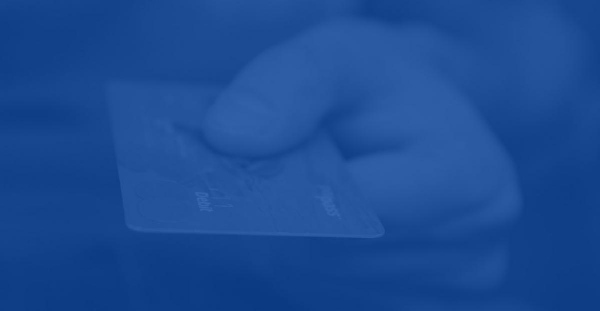
Getting Paid
Finally comes collecting the payment. The customer definitely has decided to buy, so don't blow it now! The available options should be obvious, and none of them should be phantoms that don't work. If an option isn't available for the customer, clearly gray it out or hide it.
For credit card payment, the form should accept only the right number of digits and not let the user continue until all required fields are validated. PayPal is tricky, since the customer has to go to the PayPal site and then come back. Make sure the round trip works correctly and doesn't leave the customer sitting in the wrong page.
If the payment doesn't go through, the customer should see a polite explanation that the payment couldn't be processed and get an opportunity to try again. If it works, the customer should see a page summarizing the order, in a form suitable for printing, with a big “Thank you.” It should include a reference number or link for tracking the order status.
Making it Real
No matter how much you work toward creating a positive UX, you don't know if you've done it until real people use it. User testing is essential to verifying that it works properly.
Get some people to try it out and report back what works and what doesn't. Make any fixes that are necessary, and repeat the testing until it's satisfactory. Work with testers who know how to try out different options, including the difficult cases. Encourage them to make intentional errors. The more brutal the testing process is, the smoother the customer experience will be.
A site that loses customers to a bad checkout experience loses income that was within reach. A site that makes users happy will not only result in sales, but encourage them to come back again. The checkout is the single most important part of an ecommerce site, and it's worth putting extra effort into it.
We start every ecommerce project with our "Project Booklet: User & Project Definition Workbook." Interested? Just enter your email and we'll send one right over.

You might also like
We'd love to partner with you on your next project!
Since we’re big on relationships, we’re all about finding the right fit. Will you take the next step with us to see if we’re a match?