Client Introduction
The Stanford History Education Group (SHEG) provides history-related assessments and course materials to U.S. high schools. The group “seeks to improve education by conducting research, working with school districts, and reaching directly into classrooms with free materials for teachers and students.”
Challenges
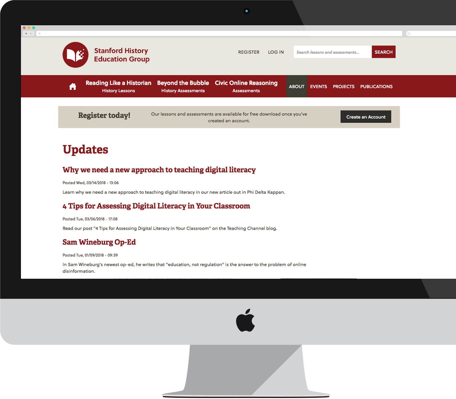
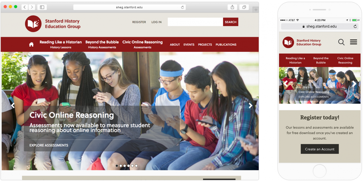
The original challenges of SHEG (a branch of Stanford University) were partly because of how content was allocated. Because funding came from two different sources, the SHEG website was branded into two separate sites – www.sheg.edu and www.beyondthebubble.com. The disparate branding (and content location) created an uncertain user experience and complicated data gathering.
In early 2017, SHEG decided the two sites should become one with consistent branding, updated messaging, and a more reliable user experience.
Strategy
Since 2014, our team has collaborated with SHEG’s team of experts to redefine and implement their goals. With a renewed focus on data collection, metrics and analytics monitoring, content management, and user workflow, our team designed the new site to align appropriately. We focused on three things:
- Creating a consistent user experience within the site (including coherent branding and updated content presentation)
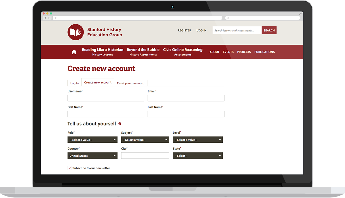
- Implementing overall data gathering (thoughtfully designed registration pages, for example)
- Developing a modern and accessible design
Design

Logo Design
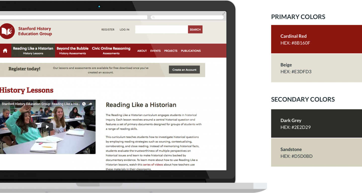
- The simplified color palette and new round logo modernize SHEG's image.
User Experience
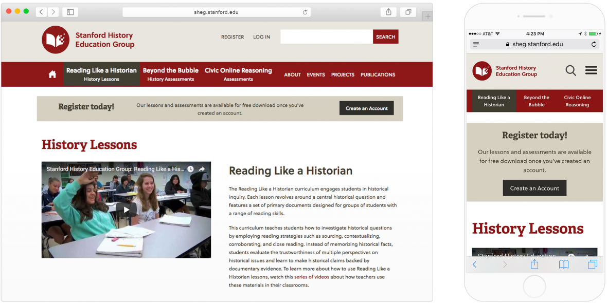
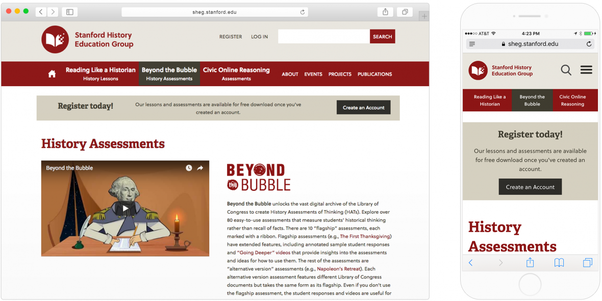
One of the first steps we took was to combine the two separate sites into one, which made the user flow more efficient and intuitive. Then we improved SHEG's ability to track engagement.
Monitoring Engagement
Development

Drupal 7 to Drupal 8
Continuous Journey
With any website ecosystem, we encourage our partners to treat it as a growing organism. We continue to work with SHEG to maintain and incrementally improve their site so that the user journey stays top of mind.