

This is the second post in the series describing the work we are doing, using the Drupal CMS to build ITALY Magazine into a leading digital media brand for lovers of all things Italian. (Part one of the series is here.)
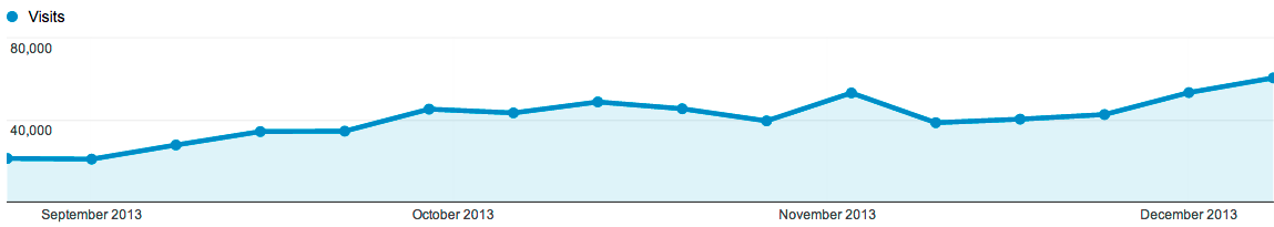
Our new site design has now been live for almost a month and our content strategy continues to evolve. As a result, we’ve seen visits to the site increase by 47.8% in the period between September 8th, 2013 and December 14th, 2013 compared to the period previous to that.
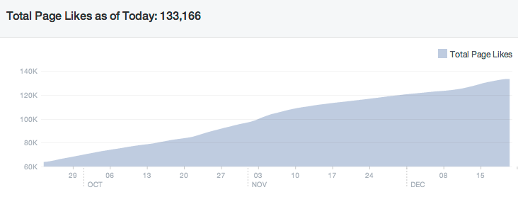
In the same period our Facebook Page fans grew from a bit over 63,000 to 133,166. Almost 90% of that was organic growth, while 10% came through targeted campaigns.
The reasons behind this growth are numerous and we will try and go through most in subsequent blog posts. Today, I would like to focus on the choices we took with regards to information architecture and how that relates to our content strategy.
Information Architecture and Content Strategy
Before we go into the details, allow me to briefly talk about the relationship between information architecture and content strategy. Information Architecture, in many ways, has a longer history for web development. It is, in the simplest sense, the navigation tools you provide your users to go through your site. Content strategy, on the other hand, is a slightly newer term and it is often described as the set of methods and guidelines for the development and curation of content coupled with the strategy for the distribution of that content across the web. It is the work you do to shape and define the voice of your brand.
Now, the question is to what extent are these two things related? For us the answer is that the two are very closely interlinked.
The information architecture of your site is one of the ways through which you express your content strategy. The choices you make about what content to highlight are just another way to express what are the more important issues for you. In other words, information architecture is another expression of your voice.
At the same time, information architecture should also be thought of as an enabler for content strategy. It helps you tell your story. It gives you the tools to lead the user through a certain path. If your information architecture does not allow certain “trips” through your content it limits the types of stories you can tell.
As such, the two are so interlinked that we believe you cannot develop one first and the other afterwards. The two have to be developed in unison and grow iteratively with your site.
The choices for ITALY
With that, let's looks at some of the specifics for ITALY Magazine. Our main objectives were:
1. Convey the beauty of Italy and provide a sense of style and attention to detail - Italy is both a beautiful country and a country driven by beauty. Our website needs to reflect that. Put simply, one of the values we need to express through our content strategy is beauty.
2. Provide an easy way for users to identify the range of content available and distinguish between editorial content and advertising or listings. However, we also need to provide means to mix the two depending on context. This is a clear requirement that our information architecture needs to satisfy. This in turn corresponds to a basic principle of our content strategy - all content is and should be valuable to users.
3. Once users have zeroed in on actually carrying out a task (finding a property to buy in Italy, searching for an experience) allow them to do that with the minimum of distraction.
These requirements led us to develop three key tools.
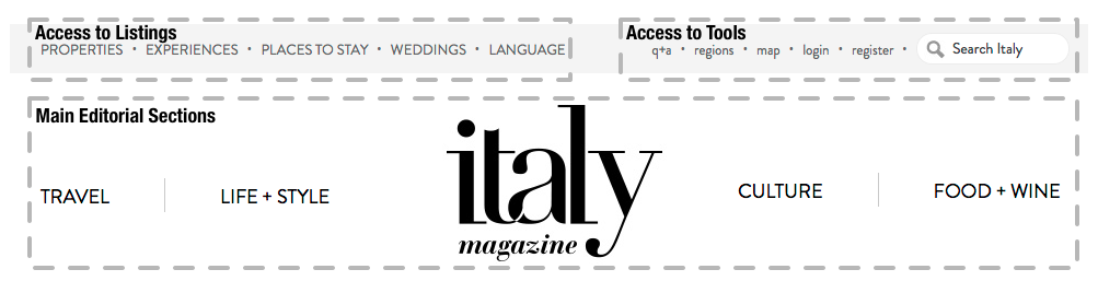
1. High-level information architecture expressed as navigation. Content on Italy Magazine is divided in listings (properties, experiences, places to stay), editorial produced by our team and information relevant to Italy. Furthermore our users typically start through a process of discovery via the editorial content before zeroing in on more specific tasks such as planning their vacation experiences in Italy. As such our header divides content in three types: Listings, Tools and Editorial with the focus being on the editorial sections. In addition, the stream (which we discuss below) allows us to mix listings and editorial dynamically on landing pages.
2. Latest Information - below the header users can find the latest information for a specific section - divided in different types of editorial (features or short stories). This provides users with a highly visual and appealing look into the latest information on ITALY. This emphasis on images allows Italy to shine through.

3. The stream - this is (from an information architecture and content strategy perspective) the most cutting-edge aspect of the page. Once we move beyond our latest content we have the ability to construct a flexible “stream" that can combine any number of different types of content. The stream is the result of algorithmic choices (using basic rules about the behaviour of users) combined with editorial control. It can mix editorial content with advertising, listings and user-generated content. It allows users to discover content they may have not thought existed in a highly visual manner and allows us to learn more about what works best for users through analytics.

So there you have it - three choices that are an expression of our values through content strategy and information architecture. On the one hand, we have objectives we aim to meet with regards to expressing our brand through content and, on the other hand, we have tools that allow us to do that on the site through information architecture. The requirement for beauty leads to navigation that is largely image-based. The need to highlight the value of different types of content and facilitate discovery leads to the idea of a flexible stream. The flipside is allowing information architecture to provide easy eways for users to complete tasks on the site. We didn't focus to much on that in this post, but will in subsequent posts. Finally, all of the above needs to serve the wider business aims of the company. That means connecting these choices to clear effects it has had on the way users interact with the site and perceive the brand. Key to determining that is collecting the right data and analysing it in in the correct way. Data collection and analysis will be the subject of our next post.

You might also like

We'd love to partner with you on your next project!
Since we’re big on relationships, we’re all about finding the right fit. Will you take the next step with us to see if we’re a match?